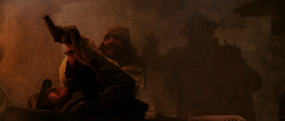
 I’m an avowed Walking Dead quitter, numbed by repetitive gore, missing the satirical bite and morbid world-building of the Romero “Dead” cycle. I’m officially bored of zombie movies, then, but a clever twist of the format can pique my interest every once in a while. Train to Busan certainly grabbed my attention by relocating a very tired concept: putting zombies on a speeding train is an efficient way to create the tension of a confined situation, and the narrative structure of a linear journey towards a possible sanctuary. But unlike Snowpiercer, that other train-based, Korean-directed disaster movie, whose vessel of apocalypse survivors was a self-contained class system, beautifully laid out in hierarchical sequence along the length of its carriages, Train to Busan has little allegorical heft or interest: this train is filled with “types”, who respond to danger in ways that distinguish or dishonour them, but that’s not the same as making them representatives of the ways power relations dictate and delimit action and experience in broader society.
  What Busan has instead is a wickedly intense first hour, building up the tension inside the familiar and believable cabin spaces [unless you live in Europe or the USA, in which case, you’ll find the comfort and cleanliness of East Asian trains borders on science fiction] and hinting through the windows at the scale of the catastrophe unfolding outside. It is built around the relationship between a distracted, workaholic father and the daughter who yearns for his attention, a touching device that pays off at the conclusion, but is rather formulaic in its message that parenthood is about sacrifice. Once the peril and melodrama are amped up in the final third and the zombie combat begins to border on the superheroic, much of the dramatic pressure dissipates into the cliches of vehicular action cinema.
 The best zombie movies indulge conflicting urges in us all: even as they tease our instinctive fears of mass-panic situations, they let us safely game-theorize possible escape routes. We gawp at disaster, while imagining ways to reconstruct society in renewed forms. Train to Busan is too slick to be completely unsettling, too narrowly focused to be enduringly thought-provoking, but it excited me for most of its running time.

Category Archives: Uncategorized
Inside Out & Pixar’s Workplace Comedies of Exile
 All Pixar movies are comedies of exile. Invariably, we are introduced to a place of equilibrium, an ordered system which is thrown into chaos when several of its members are expelled or ejected. Their return journey is a learning experience for both the exiled, who must develop skills beyond the routines learned inside the ordered system, and those left behind, who must cope with loss, failure, and who must help to reconstruct the system in a new and better image. Continue reading
Sketchin’ in the Rain
 This year I have moved from teaching university to teaching high school. Ask me about it another time: I’ll tell you in detail about it. My academic friends might be particularly interested in what the transition involves, but the main difference is something like this: being an university lecturer requires you to synthesise a vast range of sources and ideas into the conceptual understanding that makes up a scholar’s theoretical toolkit or “research profile”. Teaching high school requires you to take those big ideas and fragment them into a series of engaging, memorable and constructive tasks, enabling students to find their own way into the theoretical terrain. So, that’s what I’m doing right now. I have to remind myself what it was like not to know what semiotics is, or why film theory can be a useful tool rather than a giant muddy puddle in between me and the movies. And yes, that thing that academics often resent in education is especially true in school: you have to make the subject entertaining. Because if you don’t have their attention, you’re going to lose them, and they’re going to learn nothing.
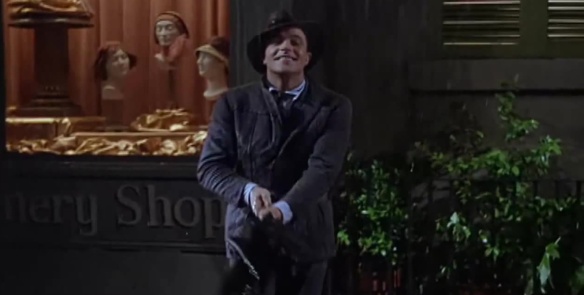
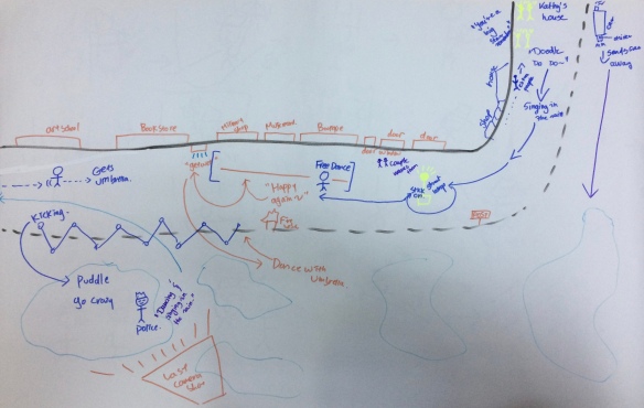
  This month our topic is film genre, and we’re looking at musicals. My students were asked to sketch a diagram of the Singin’ in the Rain dance sequence to develop their skills at observing and describing filmic space. In three groups, they drew a plan of the set, indicating camera position, lines of movement, key elements of staging, the location of extras and anything else that occurred to them while watching. I also asked them, where possible, to indicate the approximate position and distance of cameras for each shot.

I think (i.e. I can’t always trust my powers of recall) that I inherited this idea from my friend and former colleague Helen Hanson after hearing that she’d used a similar technique in a class on continuity editing. I’ve used it several times since. It’s a great, fun exercise for film students. Because films often construct space in separate shots (we never get a complete long shot of the entire set in which Gene Kelly dances in Singin’ in the Rain), trying to reconstruct the entirety of the space in which a scene takes place demonstrates how we the viewers use the spatial information in those shots to stitch together the pieces of the setting in our minds. Even if a scene was shot at several different locations, you should be able to draw a complete, coherent diagram of a single set as proof of how effectively a film establishes a similarly coherent spatial location for its action. It helps that Singin’ in the Rain is meticulously choreographed around its locations, with Kelly swinging from a lamp-post or balance-beaming down the kerb, and we can map out how those movements respond to, explore and make use of the full space. 
After the class, I did some playing with iMovie, which I haven’t used for a long time, and overlaid the students’ work onto the sequence from the film, just to show how closely their diagrams and sketches might map onto the real thing. Hope you enjoy it:
Sketchpad: Things I Only Just Noticed About Psycho
 I’ve seen Psycho many times. It’s probably up there with Star Wars, The Wizard of Oz, This is Spinal Tap and a few others which I have seen far more times than I can hope to remember. You could also count Superman II and Superman III, which I seemingly watched on a VHS loop in the early 80s and have never watched again since. But Psycho is a film that I have watched umpteen times even as an adult (you can tell how old I am by my unabashed use of the word “umpteen”). I first saw it as a spotty greasy teen, slightly disappointed that it wasn’t a raging gorefest, but I have come back to it many times, and developed a deep appreciation for the craft with which assembles its scares. But you don’t need me to tell that Psycho is good. Continue reading
Sketchpad: Steve Coogan in The Look of Love
 With his lead role as smut-baron Paul Raymond in Michael Winterbottom’s The Look of Love (a sort of Poundshop Boogie Nights set in London’s Soho nightclub scene), Steve Coogan proves that he has cornered a small market in playing sadsack, seedy and eccentric entrepreneurs with delusions of grandeur and self-importance. This would include other collaborations with Winterbottom, such as 24-Hour Party People, where he starred as Tony Wilson (“the biggest prick in Manchester, played by the second”, as Noel Gallagher, as I recall, said at the time), A Cock and Bull Story, and two series/films of The Trip, in all of which he played (a version of) himself. Continue reading
345-Word Reviews: San Andreas
 If you find Roland Emmerich’s movies too slow and subtle, then San Andreas might be for you, a b-for-bloated B-movie in which no sequence of dialogue is allowed to go uninterrupted by the shaking of the Earth, as if the cast were being warned to keep all conversations brief and cut to the spectacle. With none of the calculated, faux-shitty incompetence of a Sharknado, and none of the self-deprecating humour or satirical mischief of a 2012, this is a genre film stripped down to the basics.
When an earthquake divorces San Francisco from the mainland and pummels it with an escalating series of aftershocks, tsunamis and plummeting house prices, San Andreas compiles a bunch of Fisher-Price symbolism and fortune-cookie plotting: from the start, you know that the estranged couple will be reunited, her smarmy executive new boyfriend will die a deserving, cowardly death, and The Rock will get to save his one surviving daughter and heal past wounds, because the biggest myth of the Hollywood disaster movie is that natural disasters, rather than randomly annihilating them, bring families together.
 This pro-family message is just a pose. For the most part, San Andreas couldn’t give a fuck about any families other than the pretty one in its plot synopsis. We’re expected to cheer when Ioan Gruffudd gets his comeuppance, swatted by a container ship, ignoring the thousands of innocents standing alongside him on the Golden Gate Bridge as it takes the full force of the same preposterously large wave that The Rock surfs across in a commandeered boat, the latest in a string of vehicles he uses to fly over or zoom past the masses he might have been duty-bound to protect, seeking out instead his needle daughter in the Frisco haystack. This family of survivalists keeps all the best information to themselves and repeatedly ignore the plight of others around them. The resilience of the heroes is in inverse proportion to the frangibility of the background extras. The message to the earthquake dead in this film is that they didn’t try, fight, or drive hard enough.
  [That’s not entirely fair, because the signature image of this film is of men with injured girls in their arms, because some types of saving will always be more OK than others.]
Don’t Look Away Now
What’s with the current trend for movie posters where the hero (and sometimes the villain) gazes moodily away from the viewer? It’s as if Robocop can’t meet our gaze, or Brad Pitt is ashamed to look us in the eye, or Dwayne Johnson doesn’t want us to see him in his Hercules outfit. It could represent something of the of the recent cliche of the tormented hero, the agonising responsibilities of being responsible for other people’s lives, or just a general lazy me-too-ism of graphic design. But like the trope of turning one’s back from a couple of years ago, this trend looks like it will run for a while. I look forward to this little motif hitting peak shoegaze around about the time of the pre-release publicity posters for Superman vs Batman. They’ll both be shiftily averting their eyes from us. I plan to return the favour.
The Noir Instinct
 [I recently completed an essay on film noir references/influences in the Ghost in the Shell franchise, for inclusion in a forthcoming book on noir in East Asian cinema. In the introduction, I wrote a lengthy section arguing that film noir is almost entirely a critical construct, brought to life by the convenient way in which it helps us to group together a disparate group of films and analyse them under a similar brand as if they represent some collective response to their social contexts. Much of this lengthy introduction was not really necessary, as the book’s authors had already built most of the terminological discussion into their introductory chapter. In the final version, then, most of what follows has been cut out so that my chapter cuts more quickly to the case, but I thought the longer version, despite being disjointed in places, might be of some interest as a standalone blogpost. I’ve added a few bits of new text to clarify some points, make it all less formal, and to round off the argument at the end.]
For as long as I’ve been teaching and researching film, the term ‘film noir’ has been cropping up regularly, often applied loosely as an adjectival phrase in students’ essays (‘in a film noir style’, ‘noirish lighting’ etc.). One could easily get the impression that everyone knows what ‘noir’ is, and that everybody agrees on what it is, and that we’re all referring to the same thing when we say ‘noir’. To an extent, that’s true. It would be disingenuous to suggest that I didn’t know what you were referring to whenever you drop a couple of ‘noirs’ into the conversation. The difficulty of studying film noir is in the capaciousness of its definitions, the heterogeneity of an object of study that is supposed to describe a generic coherence. There are just so many films labeled as noir, and so many differences between them. Steve Neale has described the peculiar tenacity of ‘noir’ as a word rather than as a recognizable genre, calling it ‘a phenomenon whose unity and coherence are presumed in the single term used to label them rather than demonstrated through any systematic, empirical analysis’.[i] The invocation of the word therefore operates talismanically: once it is uttered in reference to a particular film, noir becomes a constructing force that grafts its interpretive codes onto the film text. Continue reading
The Spielberg Hundred #003: Shadows of the Lost Ark
Picture of the Week #82: The World’s Most Expensive Photograph
Last year, Andreas Gursky‘s photograph of a stretch of the Rhine river went on sale Christie’s in New York. It’s not even, I think it’s fair to say, the prettiest stretch of the Rhine. You might even call it featureless, but it does at least show the basic features of a river – water, two banks, and some sky. The sky, water, and footpath are more or less the same shade of grey, though they deepen in tone, and grow progressively narrower, from top to bottom. It has a striking symmetry, and a simplicity of structure: parallel strips of colour all the way across the image, extending into offscreen space. All is not what it seems, though: the photograph has been digitally tweaked to remove a factory building and some passersby: nothing ruins a minimalist composition like the presence of an old man walking his Shih Tzu. It’s a strong, austere image, a c-print framed on plexiglass, and quite enormous at 81 x 140 inches, but you might wonder why it sold at auction for $4.3 million (beating the previous record set by Cindy Sherman‘s Untitled #97, especially since a digital photograph is endlessly reproducible. It must look great on somebody’s wall.
I’m more familiar with Gursky’s dizzyingly detailed studies like Chicago Board of Trade (above, 1999), where the minutiae of something as potentially abstracted as a financial system are shrunk into a morass of concrete but febrile activity. It is at once systemic and messily chaotic. Rhein II has a wholly different vibe. Is it a homage to, or a parody of romantic landscape painting, or just an assertion of the singular abilities of photography to “store” a fragment of a place for our future, vicarious pleasure?


