 [This is an edited extract from “‘Only This Can Make it a News’: The Language of News Media”, in James Leggott & Jamie Sexton (eds.) No Known Cure: The Comedy of Chris Morris. London: BFI/Palgrave, 2013. In this essay I analyse the use of graphics, idents, and title sequences in the news parodies of satirist Chris Morris. In this section, I discuss the title sequences that begin The Day Today and Brass Eye.]
Station logos and programme insignia serve connotative as well as nominative functions; they iconically refer to the names of things, but their designs also activate meaningful associations for viewers. The graphic design template of each show is firmly established in their title sequences. John Ellis has analysed the Day Today title sequence, noting that it is characterised by ‘a sense of excess of meaning, of heady overstatement within familiar forms’; it exaggerates the tropes and clichés of the opening of a news show.[i]
A montage of library footage filtered through digital surface simulations show the multiple foci of the programme (politics, war, celebrities, sport) in a mixed arena of metallic, granite and liquid structures that fluctuate between solidity and fluidity: the design connotes encyclopedic versatility, the image speaks of confusion.We might therefore find a skewed logic at the heart of these title sequences, where solid things float or hang in the air, or change their form spontaneously. See, for example, the ITN Channel 4 News idents first broadcast in 1985, where a rotating metal logo comes into view – such logos are almost always moving, seemingly under their own agency, or forming a single, finished shape over the course of the sequence (as if to suggest a coming-into-view, a clarifying of the obscure, or a bringing together of miscellaneous elements into a cohesive whole). From October 1984, work was undertaken to overhaul and standardise the look of ITN News titles as metallic lettering, and this extended to typography, using Cal Video’s ‘Chrome’ software to create the appearance of metallic surfaces.[ii] It would probably have been possible to make and shoot the logo practically, using real metal, but the digital simulation permits the ideal and paradoxical combination of malleability and apparent solidity.
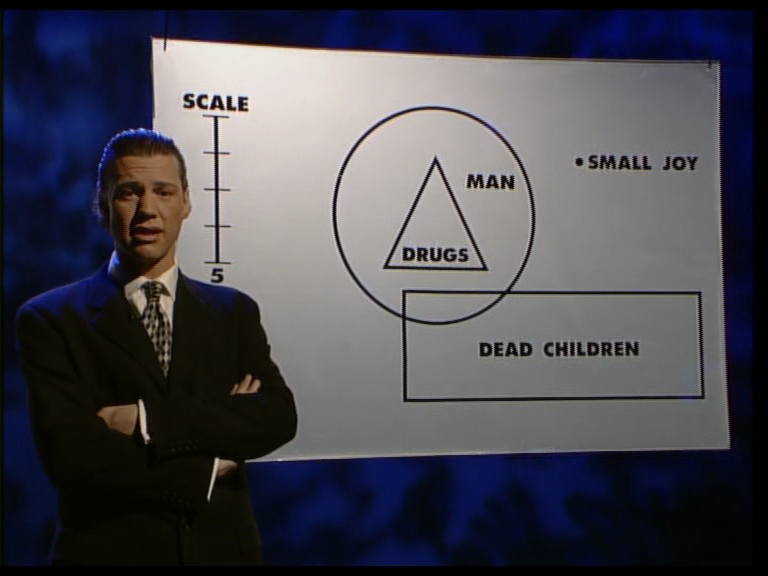
The Brass Eye title sequence is, like The Day Today titles, a sequence of morphing snippets of found footage, shuttling between banal celebrity and world-changing events – we cut from Kate Moss to Liam Gallagher to an exploding fireball, as if his flipping of the v-sign at reporters triggers the bomb. It looks as though the show might be insinuating interconnections between famous people and events of global significance, but at another level this is in keeping with Brass Eye’s thesis that celebrities rarely have anything productive or interesting to add to current debates: they are merely part of the promotional surface; because they are all passed through the same televisual gauze, we are supposed to infer that they should be subject to the same interpretive schema.
Brass Eye replaces the blue and red corporate design template of The Day Today with an even more intense, infernal aesthetic, as if insisting that the content of the show will be as incendiary as its idents. The title sequence agglomerates many of the clichés of its genre, mixing them into a surfeit of style and symbolism. The ‘brass eye’ itself, another metallic digital structure, resembles the ‘eye’ logo that has represented the American CBS network since November 1951. It simultaneously reflects both the watching eye of the spectator, and the surveilling gaze of the show’s cameras as they watch the world.[iii]


The eye emerges from a spinning globe, and is then shown to be Morris’s own eye, and the title sequence ends with Morris emerging from the fiery chaos in the form of Leonardo da Vinci’s ‘Vitruvian Man’ (Homo ad circulum, c.1490). It is well chosen hyperbole. Da Vinci’s drawing embodies connections between art and science, positing the human body as a centred, symmetrical structure, as measurable and quantifiable as a geometric shape or an astronomical constellation. We are thus given an overwrought convergence of the artistic, the mathematical, the scientific and the natural, all cohering around the body of Morris himself in the Brass Eye title sequence. Once again, he is proffered as the conduit of meaning, the central point of knowledge and perspective: if the show is seeking to establish in its titles that it bestrides and surveys the world, the visual effect puts forward the contrary notion that the world is instead diminished, contained.
Sean Cubitt has argued that popular media, so capable when it comes to human-interest stories, tend to struggle with abstract concepts such as ‘labour’, ‘class’, or the flows of trade and power in globalised industry. As a result, he says, globalisation is often conceived in spatial rather than historical or temporal terms, and the prominence of globes in the idents of news shows is ‘symptomatic’ of this ‘anti-dialectical understanding of the world’, since it gives the impression that the world can be interpreted, even as the world has become even less readily comprehensible, drawing the chaos of human events ‘into an objectifiable unity that can be addressed as content: as stories, as graphics, as maps.’[iv] Again, the globe graphic serves the function of reducing the world to an illusion of certainty and containability. As Cubitt continues, he is concerned with the constitution of:
the world as videographic, implicated as it seems to be in nostalgia for an authoritative discourse while knowing that no such authority exists. This constitution of the world builds an ideological image of the world-object as author of its own authoritative statement, a statement which, however, is limited to the merest announcement of existence and the solitary statement of its own unity. Such a limited conception of truth is the bread and butter of documentary analysis.[v]
For Cubitt, ‘machine-drawn images’ have the quality of externality: the videographics of globes seem to take place in an abstract space devoid of human presence, as in Morse’s ‘miniature cosmos’, and yet, he argues:
in the context of news titles, imagery of the world rarely uses the kind of humanist expression of icons like the Vitruvian Man […] Unlike Leonardo’s sketch, our representations of the Cosmic Man are neither cosmological nor expressions of a transcendent mathematical ideal.[vi]
However, the opening titles of Brass Eye do incorporate Morris himself as Vitruvian Man, establishing the presenter as the ideal man, the centre of intellect and space, tapping a seam of Renaissance certainty about the mappability of the external world. This is not really an omission from Cubitt’s analysis, since Brass Eye is not a real news programme; instead, it shows how Brass Eye’s titles transgress a borderline of taste by anthropomorphising its worldview, subjectivising the perspective that it would otherwise have you perceive as an objective, worldly gaze.


Morse notes that the term ‘anchor’ seems to denote a fixed point around which the news pivots, and that the figure of the news anchor ‘centres the discourse of the news and himself occupies a zero-degree of deviation from the norm.’[vii] She refers to anchors as the ‘supersubjects of the news as a totality’; through the situation of the anchor in Zettl’s first-order space, apparently responsible for the mediation of the graphicated second-order space, Morris can appear to be not just reading the news but ‘responsible for its enunciation.’[viii] If Morris is the personification of the news, the video graphics link his body and the flow of information itself, most notably (and literally) in The Day Today when shifters emerge from his body to effect a transition to the next report: Here is the visual equivalent of the corporeal language often used in the show (e.g. ‘news felch’, ‘fact me till I fart’ etc.), the end point of the graphication and personification that locates Morris as the source of news that is ultimately reduced to an excremental or abject metaphor, a second-order space emanating from inside him.
 Elsewhere, his disembodied head is superimposed onto reports, inserted into the videographic space, as are those of other personnel on the show, including weatherman Sylvester Stewart (David Schneider), who crosses the border of second-order space to become his forecasts, and Collaterlie Sisters (Doon Mackichan), whose robotic mannerisms and intonation reflect a too-keen ingestion of the tone and form of her profession. The news system has fused with the people who make it, absorbing them into its structures.


[i] John Ellis, Seeing Things: Television in the Age of Uncertainty (London: I.B. Tauris, 2000), p.96.
[ii] Douglas Merritt, Television Graphics: From Pencil to Pixel (London: Trefoil, 1987), pp.82-3.
[iii] See Margaret Morse, Virtualities: Television, Media Art and Cyberculture (Bloomington & Indianapolis: Indiana University Press, 1998), p.73.
[iv] Sean Cubitt, ‘TV News Titles: Picturing the Planet’, Jump Cut: A Review of Contemporary Media (48, Winter 2006), <http://www.ejumpcut.org/archive/jc48.2006/CubittGlobe/text.html>
[v] Ibid.
[vi] Ibid.
[vii] Margaret Morse, ‘The Television News Personality and Credibility: Reflections on the News in Transition’, in Tania Modleski (ed.), Studies in Entertainment: Critical Approaches to Mass Culture (Bloomington: Indiana University Press, 1986), p.57.
[viii] Ibid, p.57.

Great essay! Thankyou. Also writing about Chris Morris and have referenced your essay!